Elevate International
Elevate International is called to transform and equip the urban community to impact culture--one youth, one family, one generation at a time.
Overview
Elevate International, a non-profit organization, has been dedicated to uplifting urban city youth for over a decade through its flagship initiative, Camp Elevate. In 2009, Elevate expanded their impact with the introduction of Elevate Remix, a young adults retreat designed to cater to the evolving needs of this crucial demographic. Elevate offers many programs to help individuals grow and elevate their relationship with Christ throughout the year. Elevate programs are designed for you to connect with God and connect with others. From group mentoring for boys and girls, to a discipleship program for youth seeking more, to a program that helps dads better connect with their children, Elevate ensures there is something transformative for everyone.
Challenge
We embarked on our brand journey with Elevate International already established for a few of years. Though initially named after its founder, EI had successfully transitioned into a distinctive entity, committed to transforming and equipping the urban community.
Elevate sought the expertise of 328 Studios to manage their marketing efforts. However, effective marketing relies on a strong brand. EI had little strategy and their visual identity only composed of a logo and a color. EI was in need of a brand that was recognizable, energetic, and adaptable to target the youth and young adults. Given Elevate's active engagement with numerous events, establishing a strong brand foundation had to occur concurrently with ongoing marketing initiatives.
Strategy
When we began collaborating with Elevate International (EI), they had already transitioned to Elevate International a couple of years prior, with a modest visual identity consisting of a logo and the color orange. We knew exactly where to begin. Our focus was on standardizing the brand and defining the essence of Elevate International through the development of both verbal and visual identities.
We opted for the "Everyman" brand archetype for Elevate International, aligning seamlessly with an organization deeply rooted in relational connections and being down-to-earth. EI's brand personality was centered around 4 core principles: relevance, urbanity, Christ-centeredness, and integrity. We believed these personality traits made EI approachable and relatable, and further refined the verbal identity through messaging and voice.
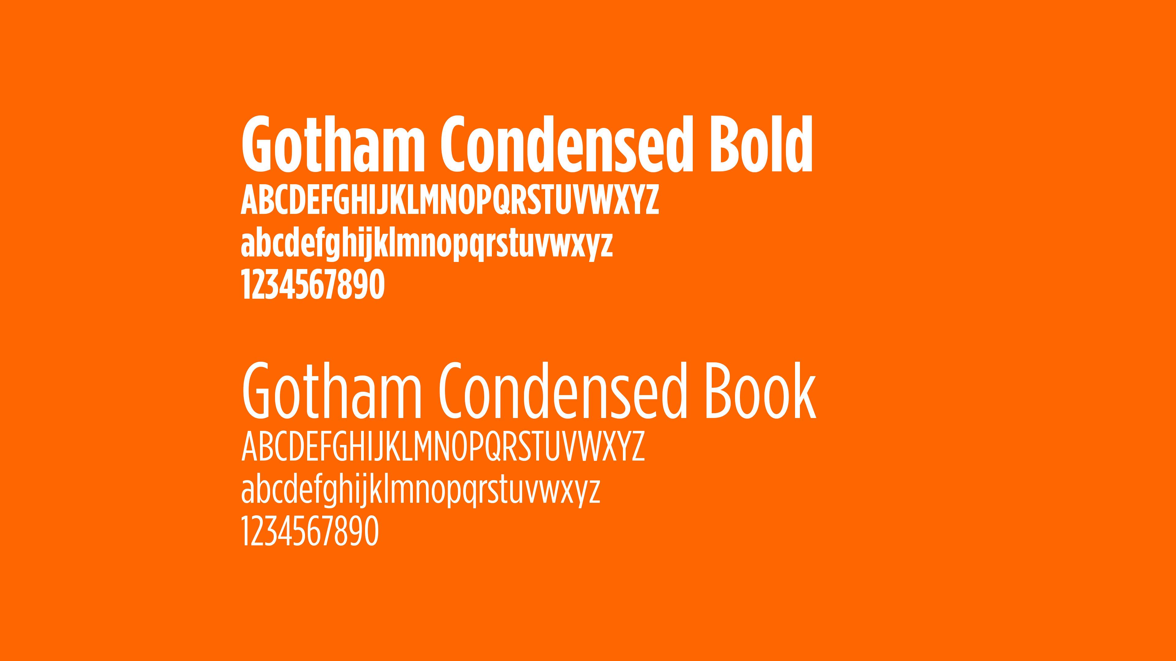
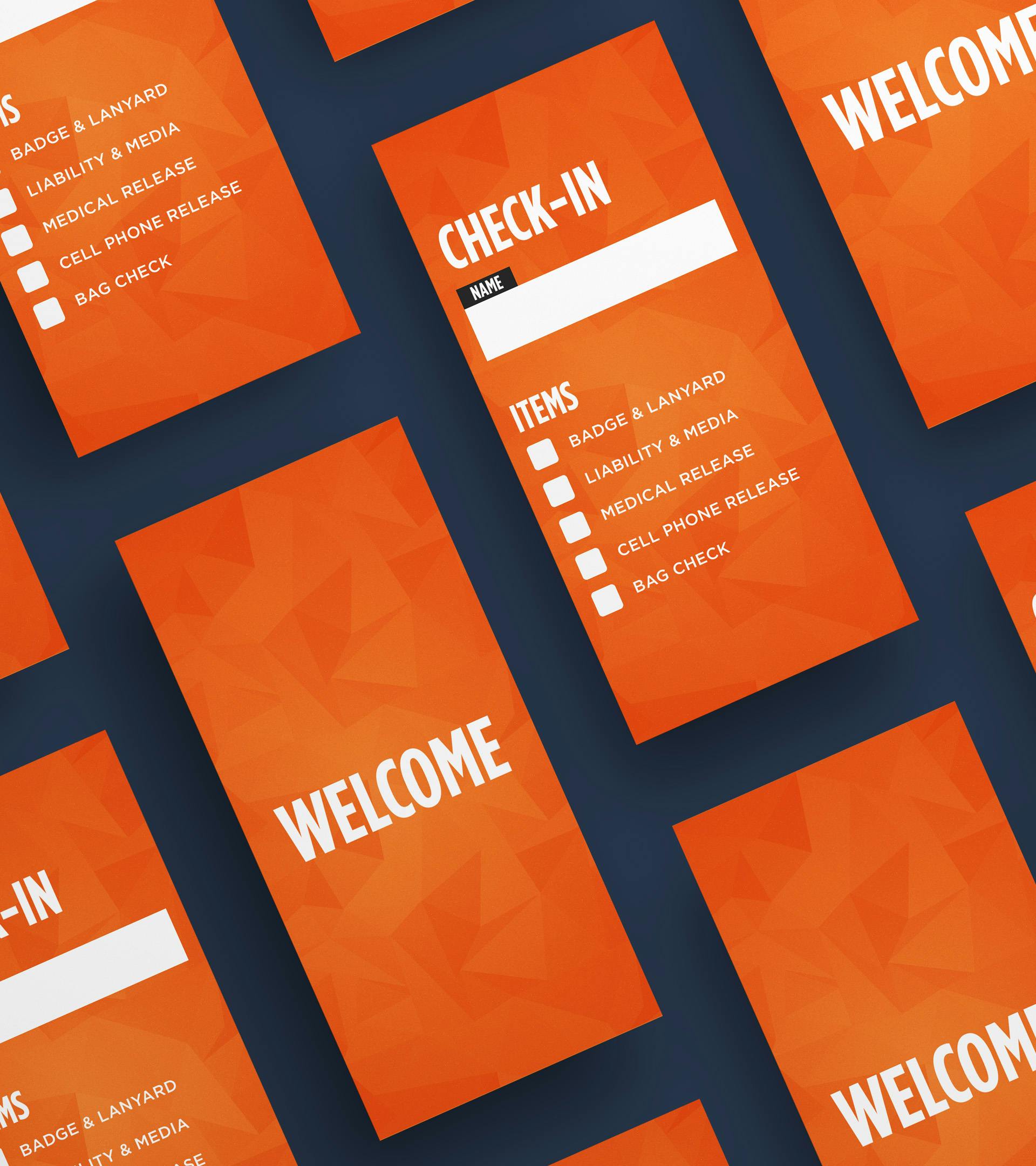
With a solid personality foundation, we worked on developing the visual identity. The first step was to establish which shade of orange we would be used, but this was something we came back to a little later. We knew we wanted a brand that was vibrant and energetic, so we created a color palette that did just that. With orange as the primary color, we selected colors that would compliment and allow the orange to stand out even more by enhancing its vibrancy. To maintain approachability, we embraced minimalism and prominently featured people and faces to encourage connection and ultimately be approachable. We selected Gotham Condensed, a versatile font with many weights that enhanced the minimalism while providing flexibility to be used across different channels from social media, to documents, to graphics, to announcements on a screen. These elements worked together to create an attractive and pliable visual identity.
Strategy (cont)
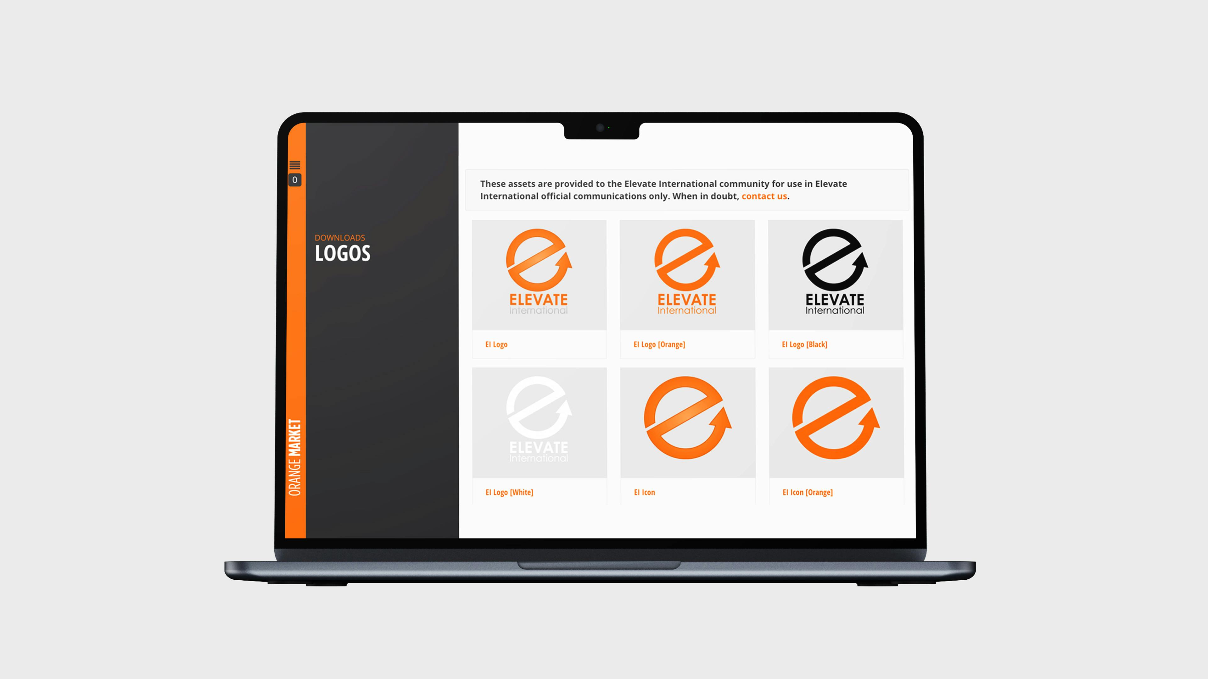
We create The Orange Book, a comprehensive guide outlining the dos and don'ts of the new brand. This information was also accessible online through The Orange Market. The Orange Market was for internal use providing easy access to brand guidelines and downloading of logos in high quality, different formats (jpg, png, and eps), and the brand colors. The Orange Market would serve as a vital tool in standardizing the brand and ensure compliance across all channels.
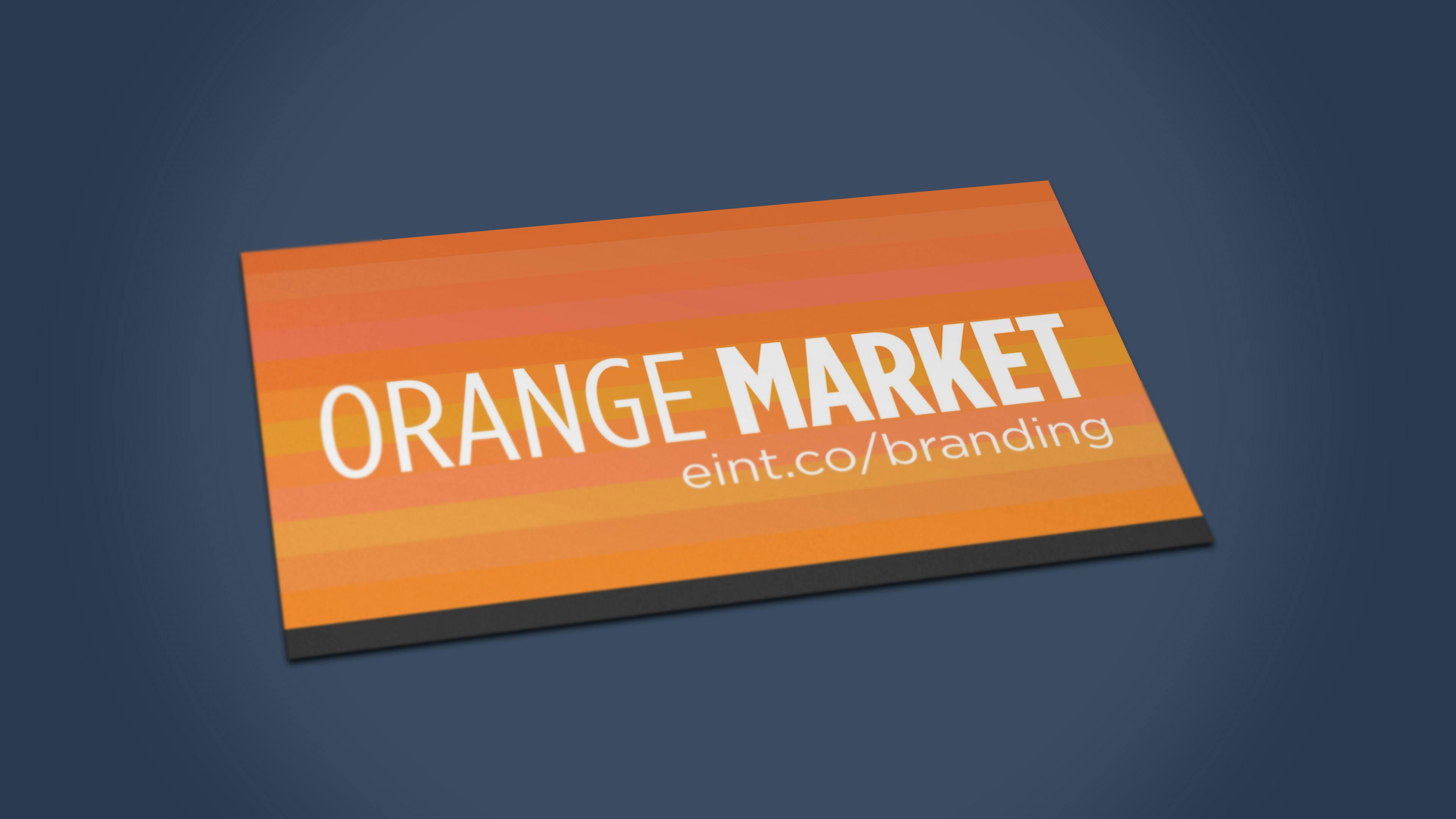
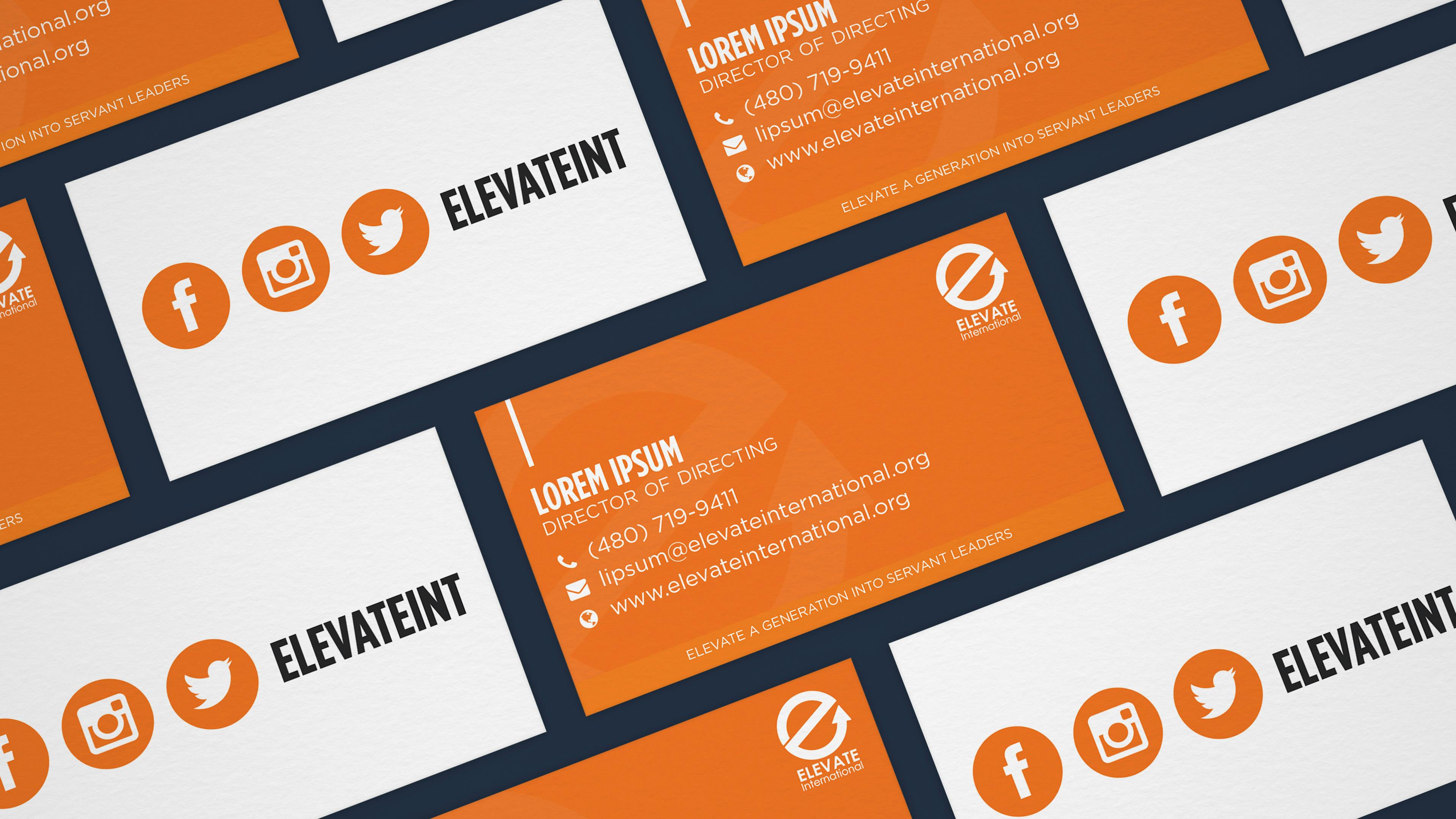
We will had a an issue, what orange would we use. We wanted an orange that was vibrant and unfortunately, what you see on the screen, isn't what is printed. We decided to do a trial-and-error process by creating a business card with shades of orange we had liked so far. To maximize usage, we used these business cards to promote The Orange Market.
This was our first tangible print with the new visual identity, albeit without a finalized orange shad. Our objective was clear: to choose an orange that exuded energy and vitality. Upon receiving the business cards, we selected the brightest shade of paper, #FF6600, affectionately known as Elevate Orange.
Strategy (cont)
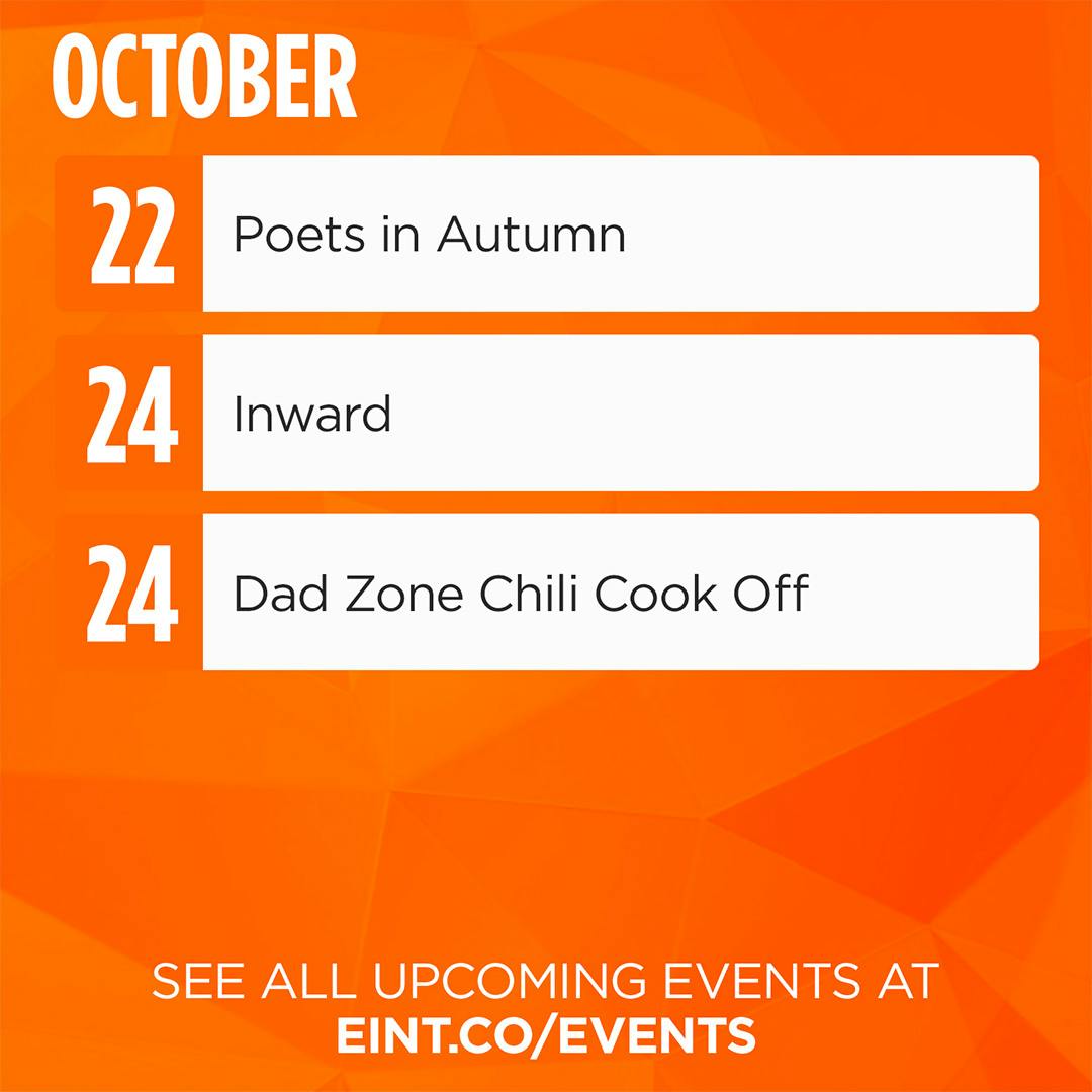
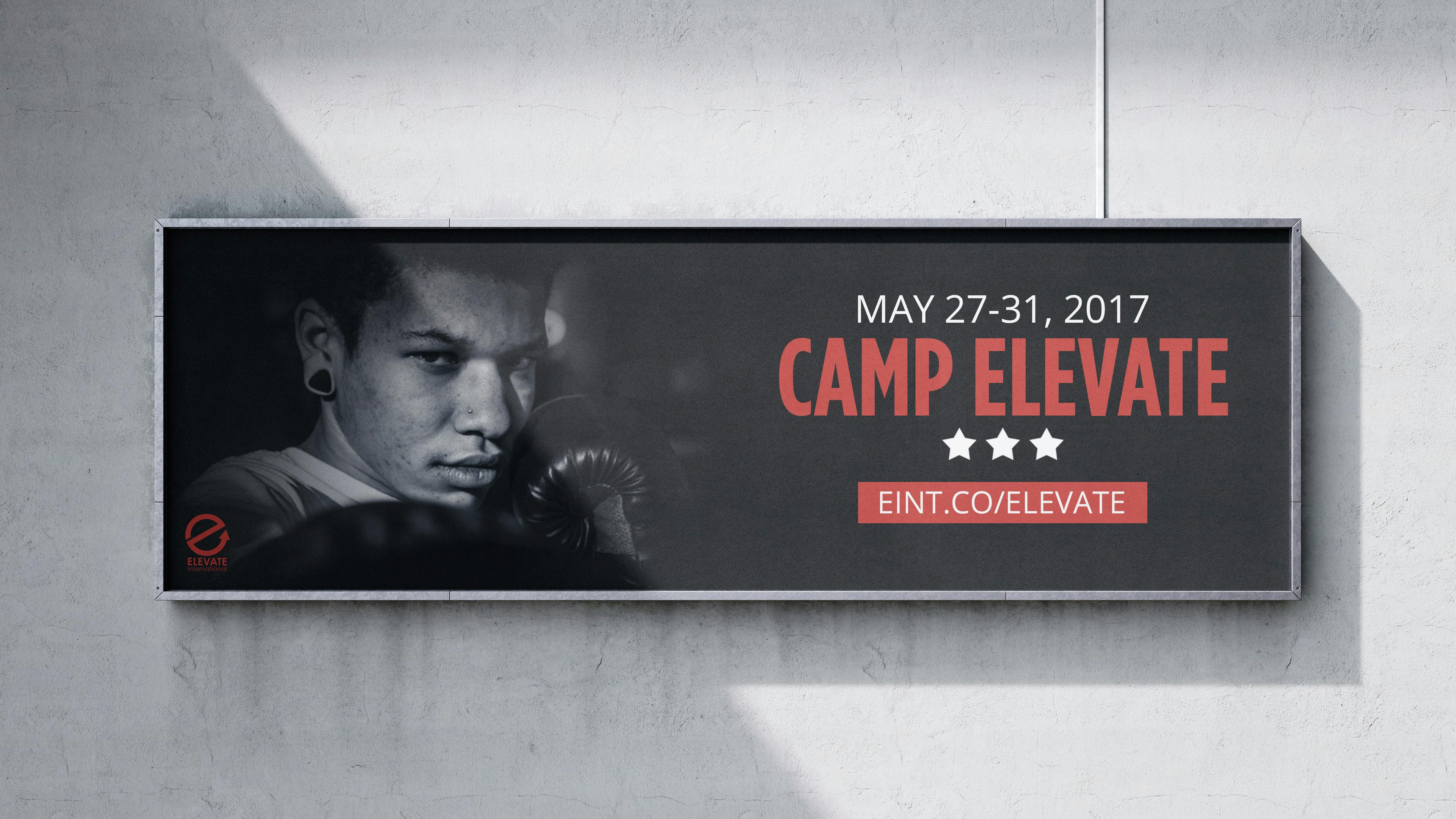
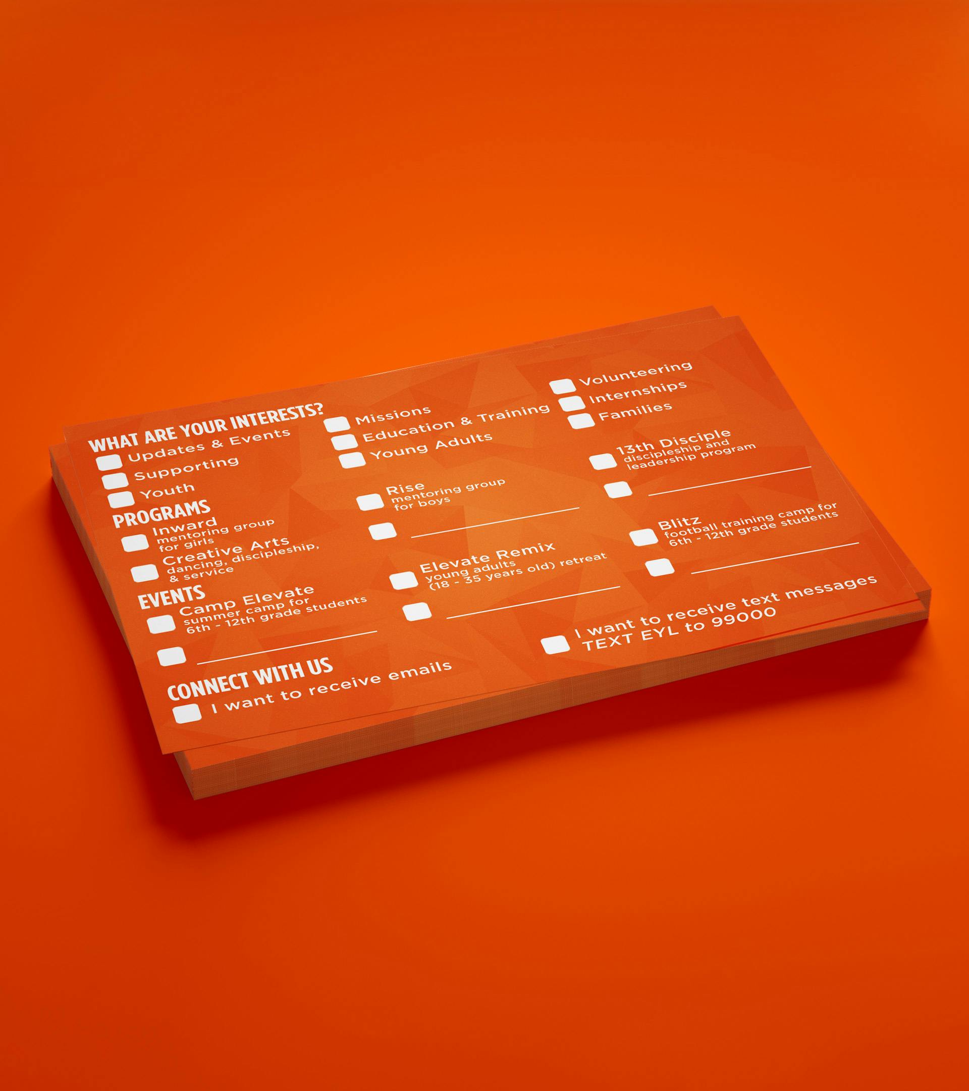
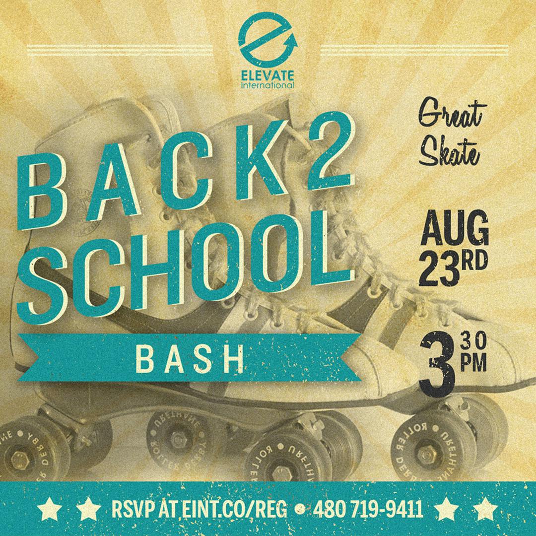
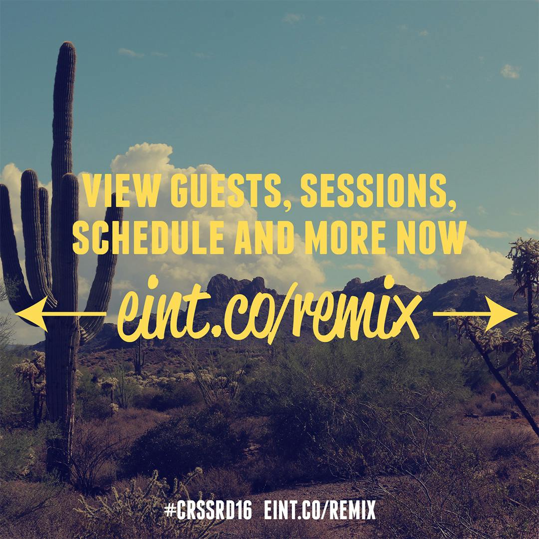
While Elevate offered numerous events throughout the year, often these events were promoted with insufficient lead time or at the last minute. To address this, our content strategy prioritized timely communication with our audience regarding upcoming events and programs. This involved creating a monthly calendar highlighting all events, dedicating posts to each event well in advance, and issuing reminders closer to the event dates.
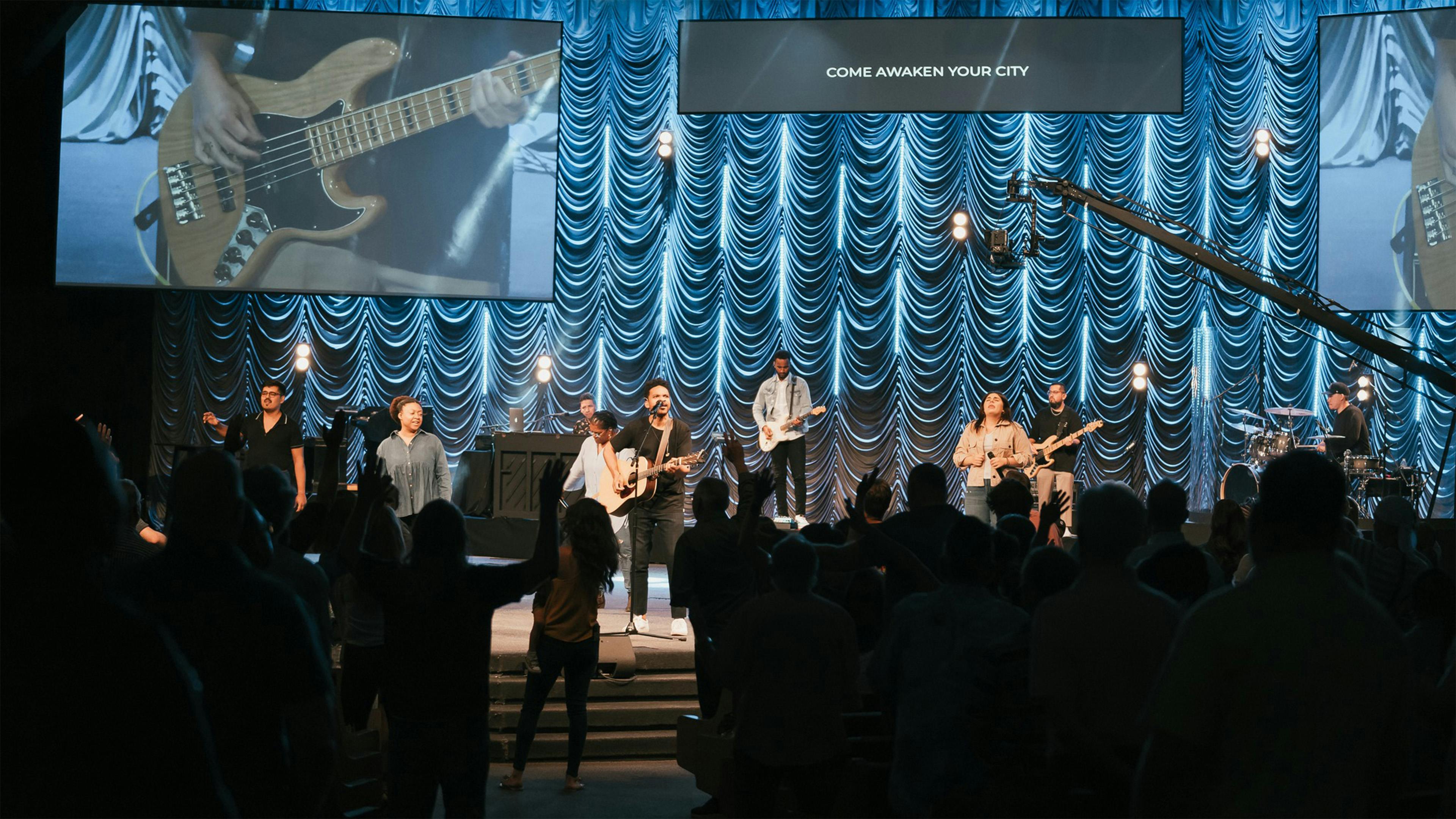
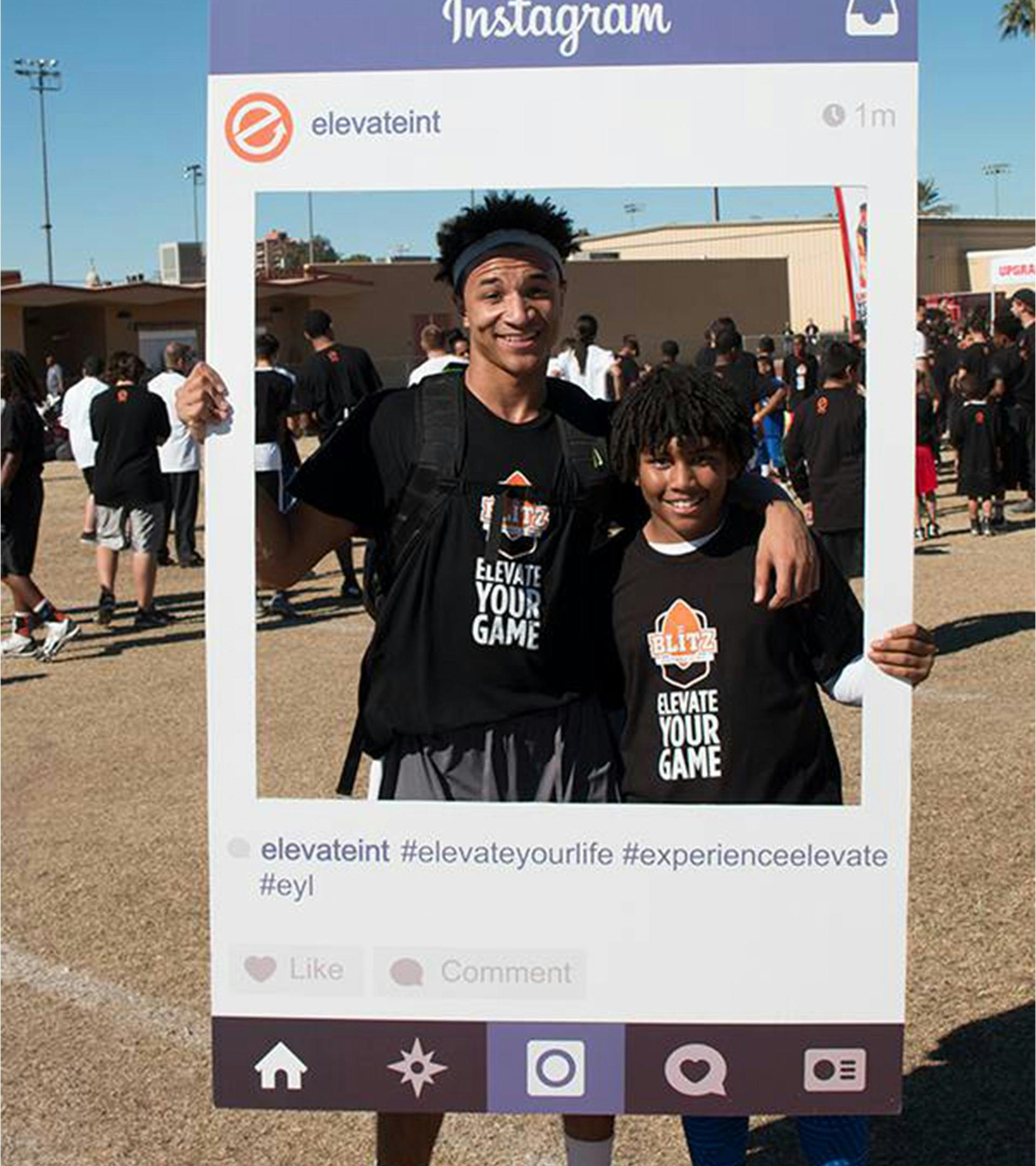
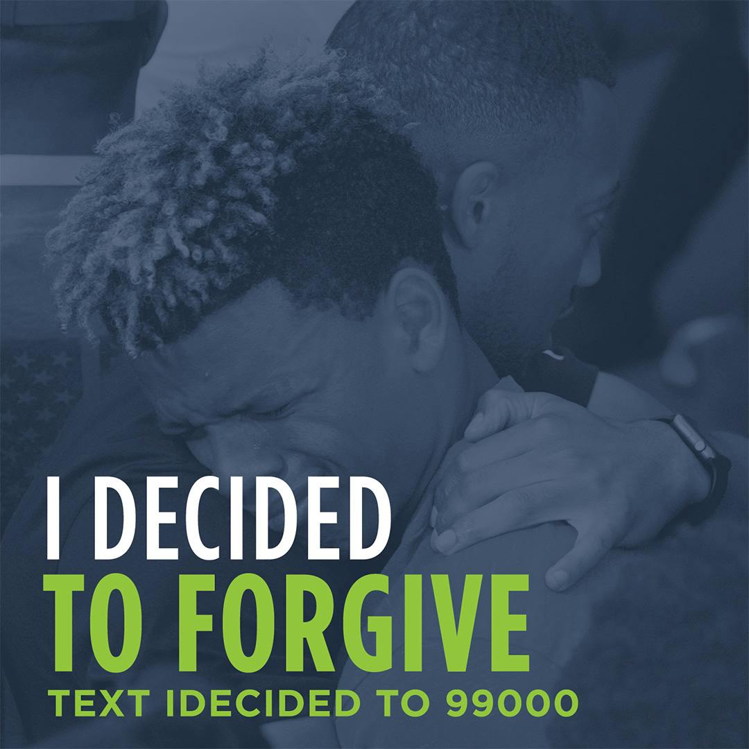
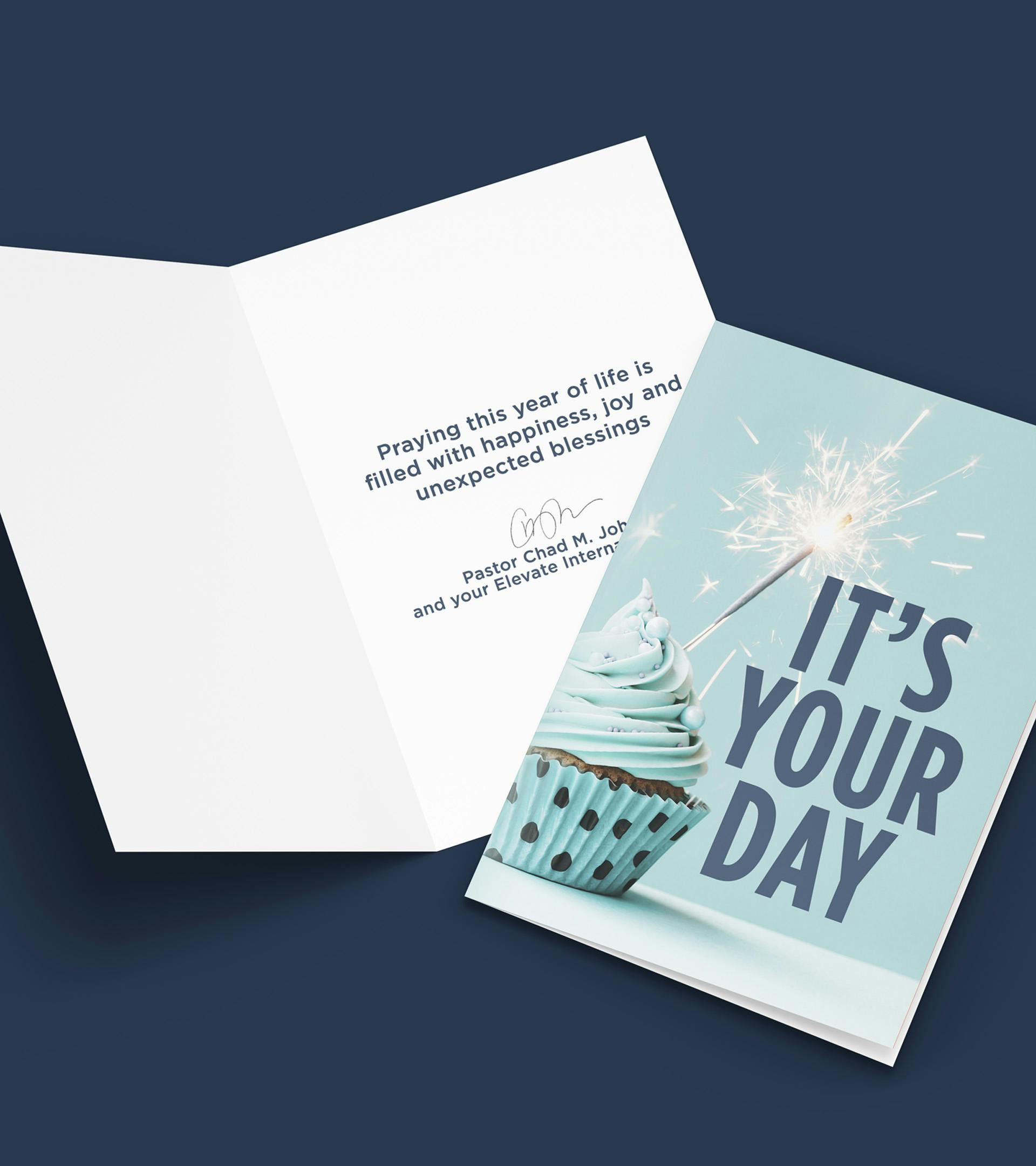
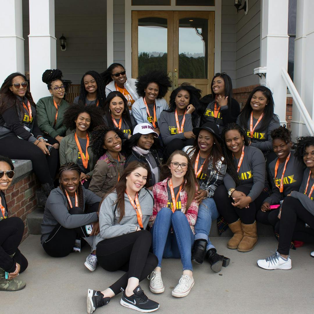
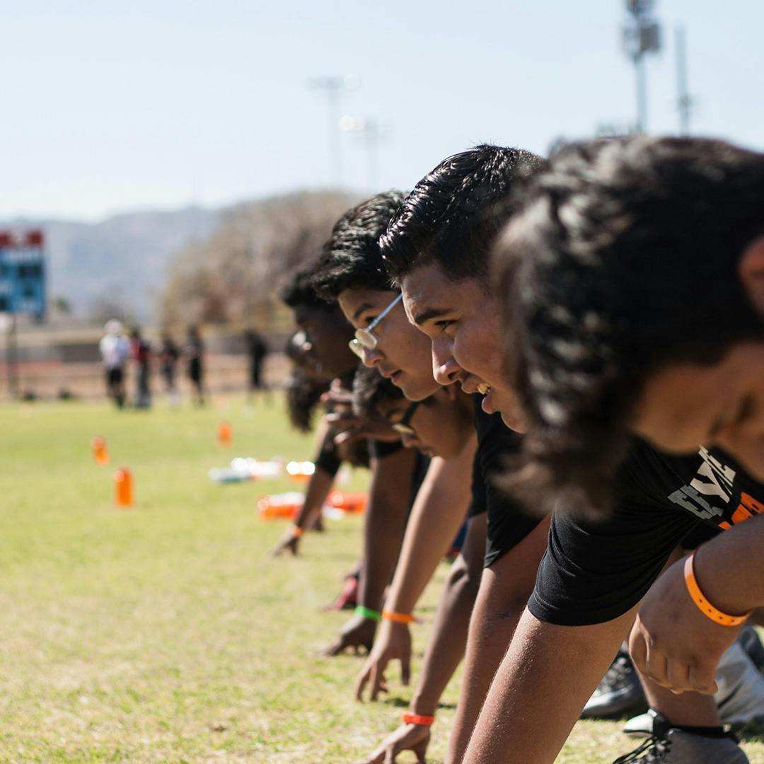
Given the frequency of Elevate's events, it was essential to strike a balance between event promotion and other types of content. Adhering to the 80/20 rule, we ensured that no more than 20% of our posts were dedicated to event promotion, emphasizing our goal of fostering connections. Fortunately, Elevate's media team captured an overwhelming amount of photos that remained unseen and left on a hard drive for backup. We made a deliberate effort to showcase these photos, focusing on capturing moments of human connection to reinforce our relatable brand identity. More faces, more smiles, more connection. These images were not only shared on social media but also utilized in promotional materials both online and in print.
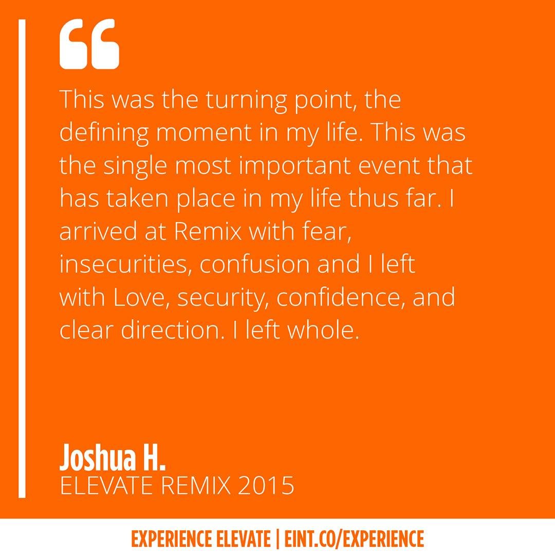
Finally, we encouraged event participants to share their experiences with us, with the option to remain anonymous. These testimonials were then featured on our social media platforms, further enriching our online presence and fostering a sense of community engagement.
- Elevate International

- Elevate International
- Elevate International

- Elevate International
- Elevate International

- Elevate International
Strategy (cont)
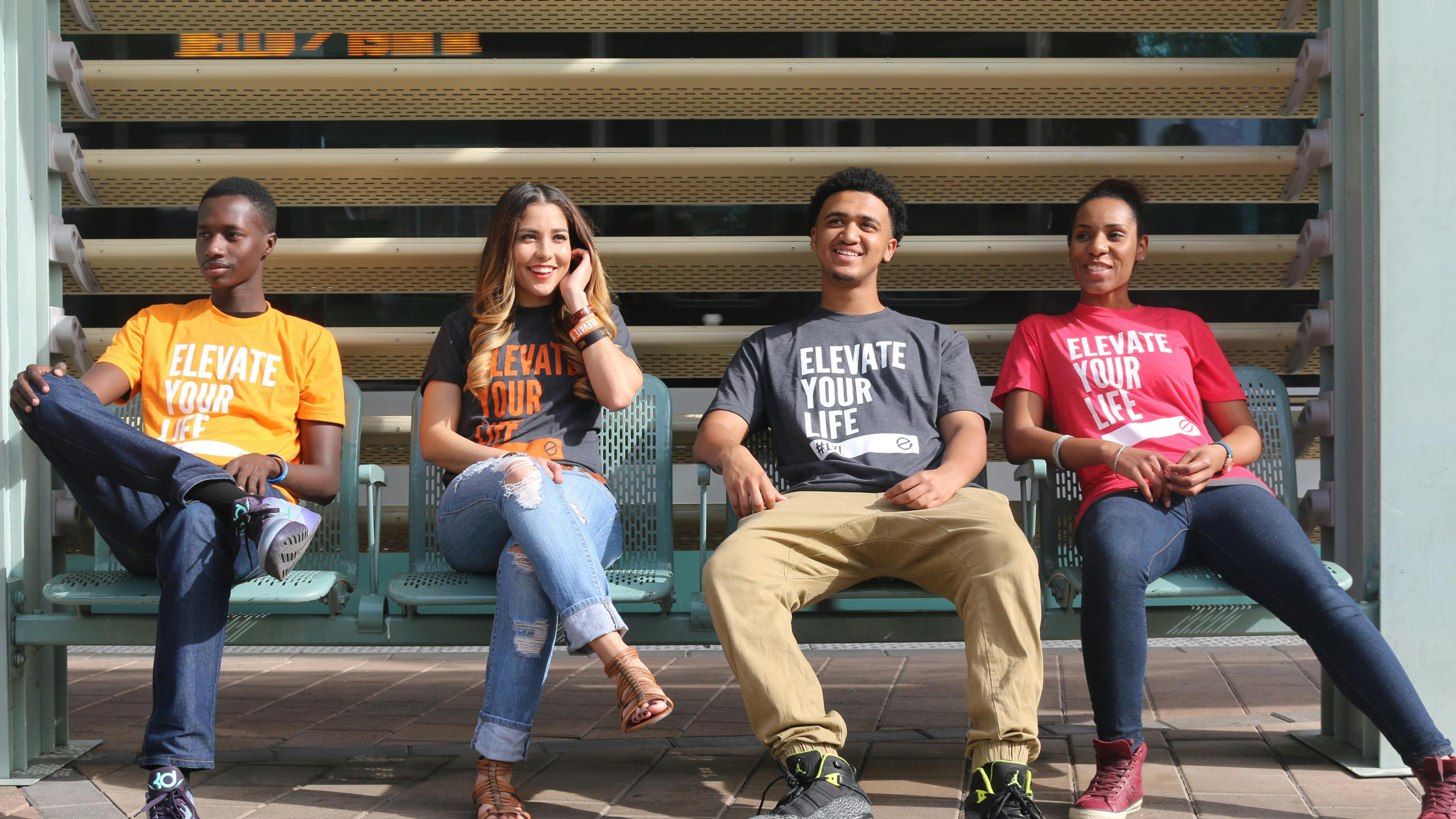
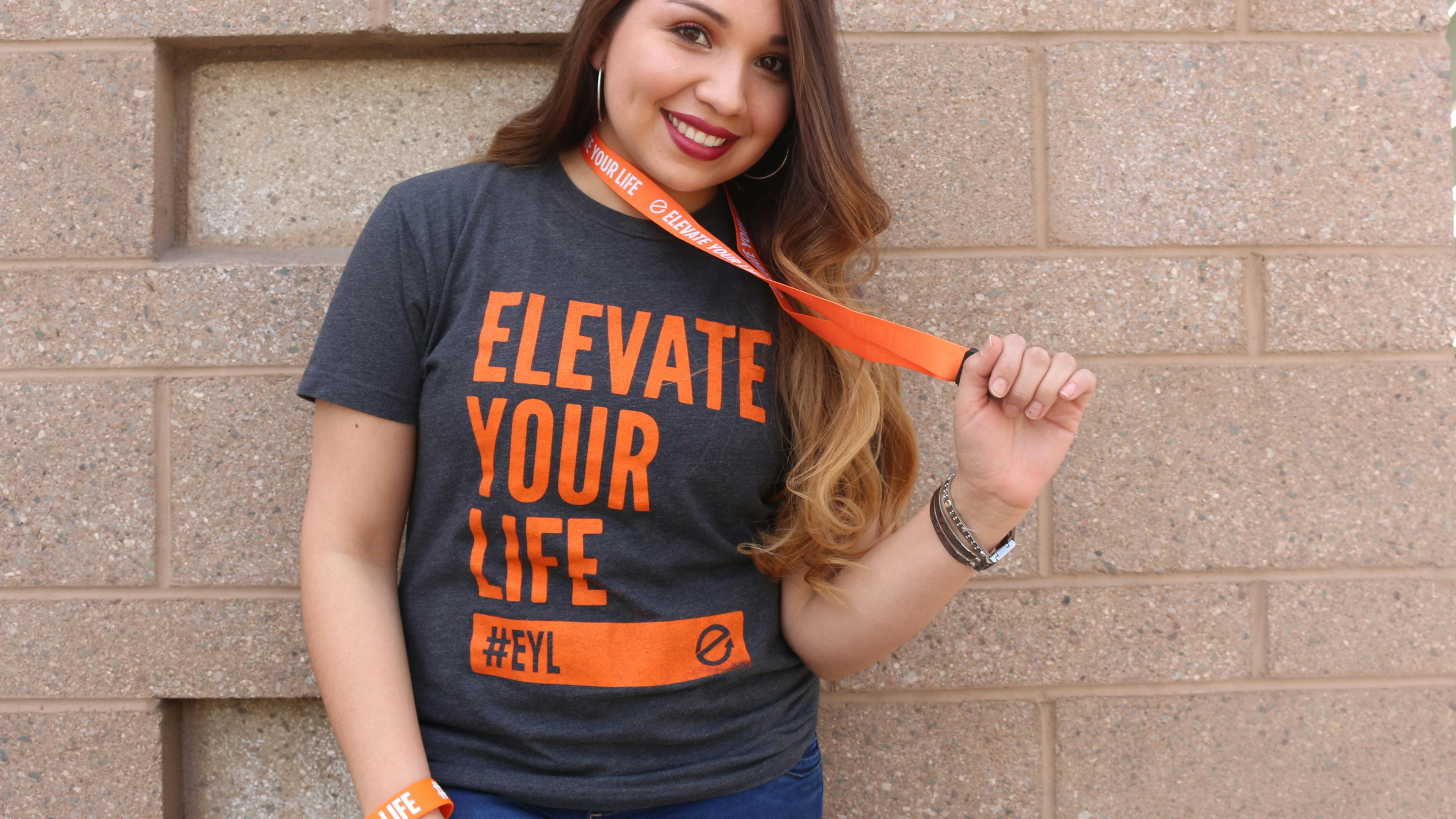
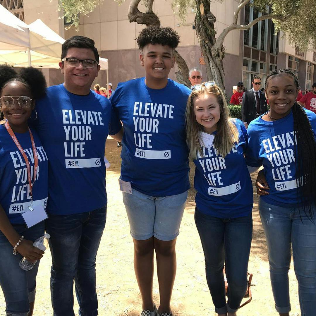
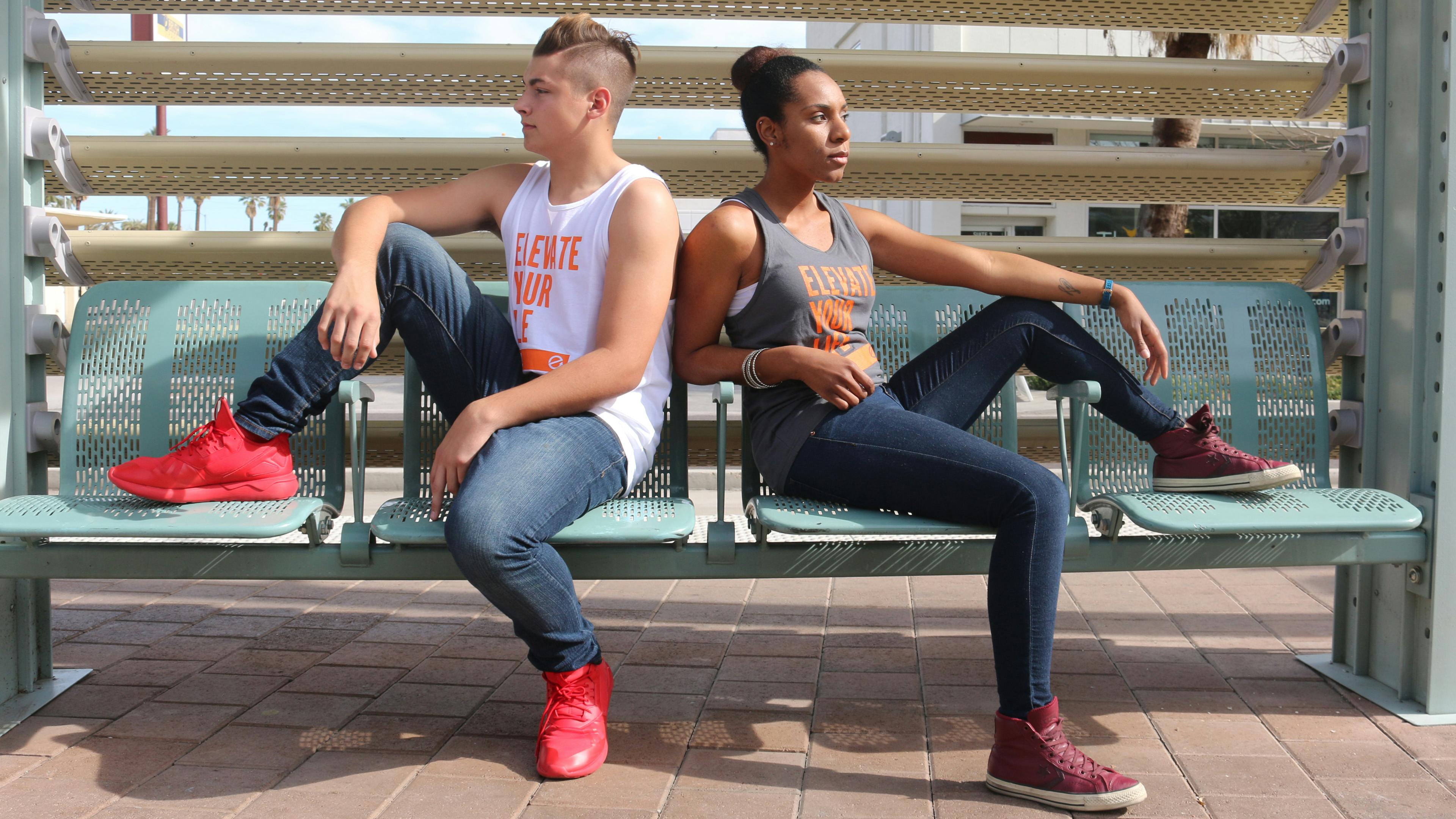
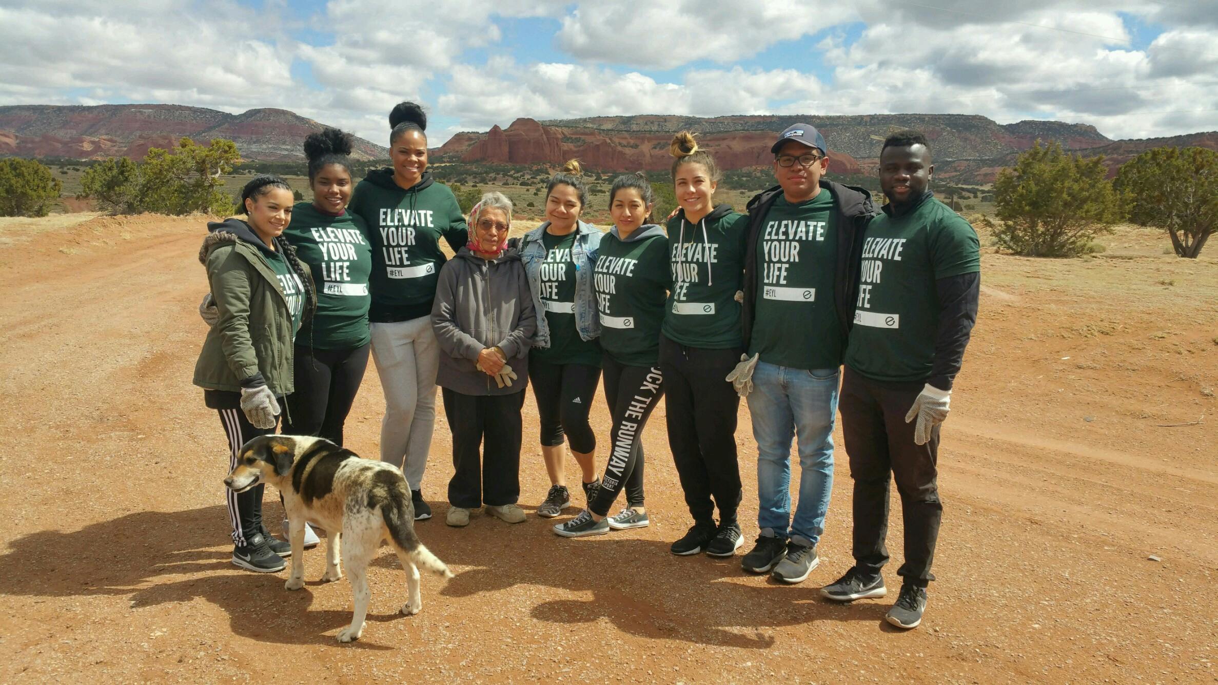
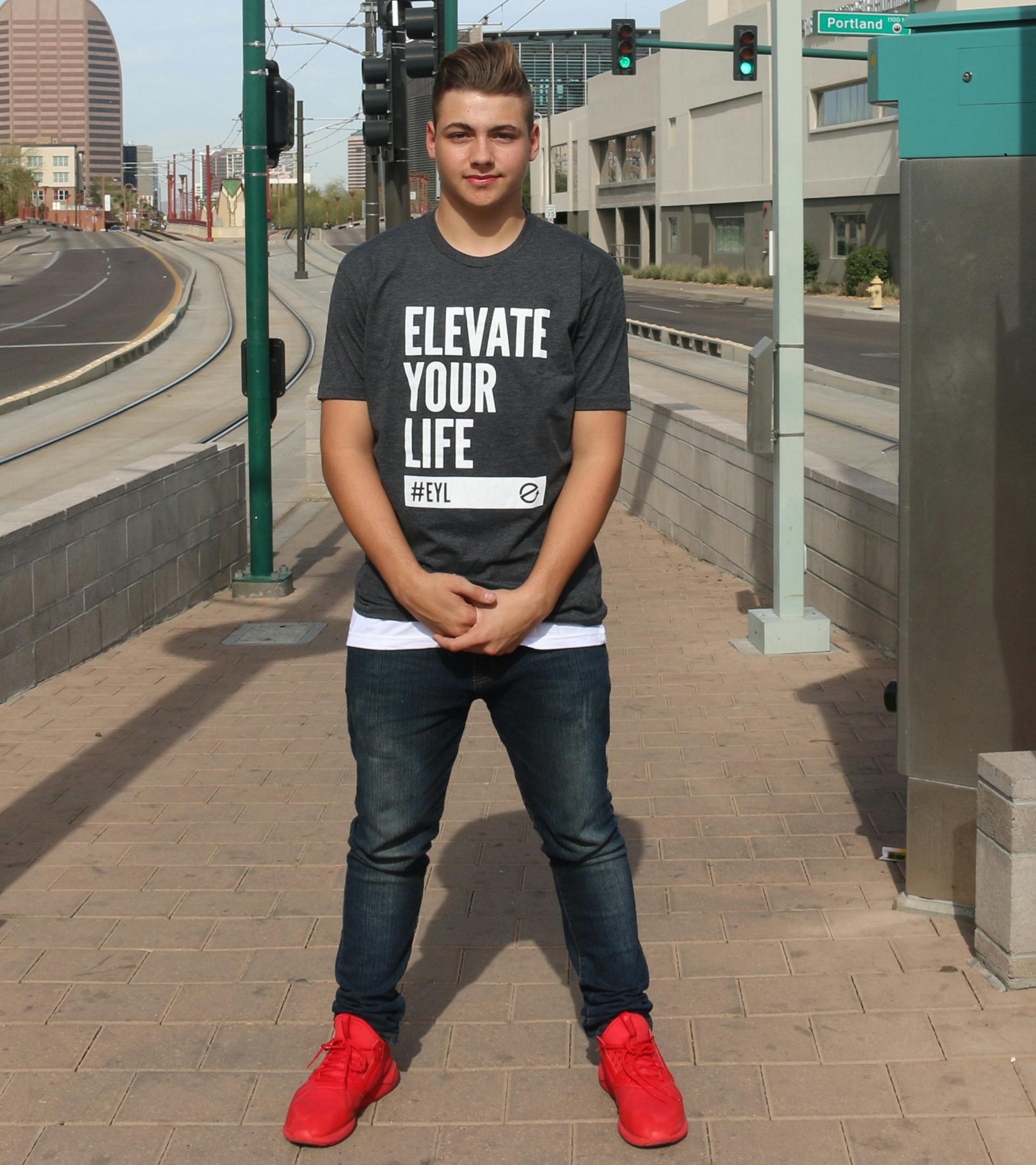
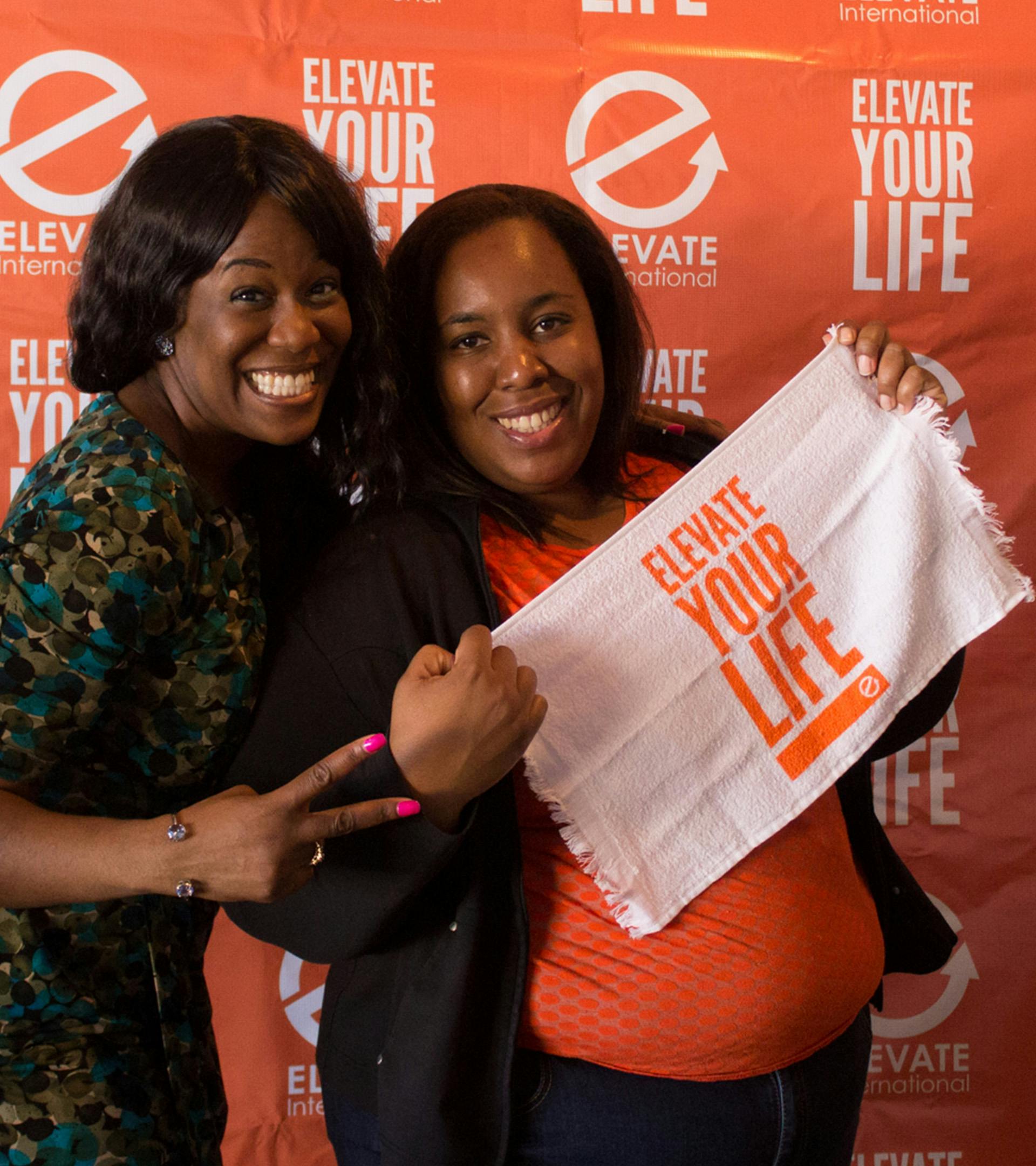
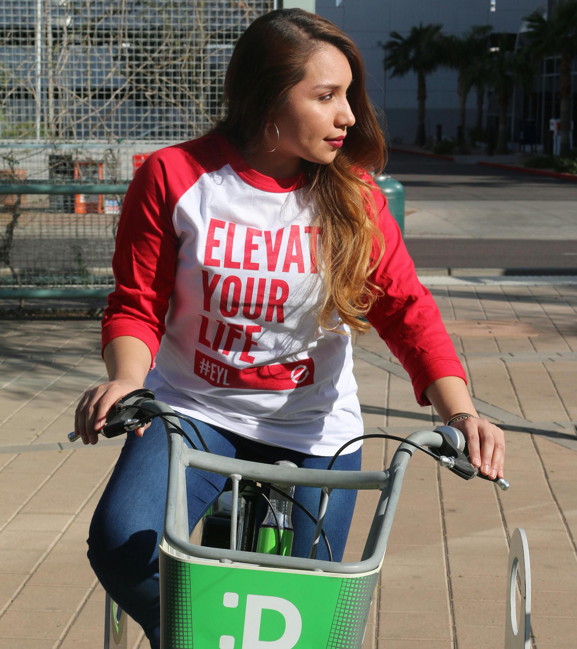
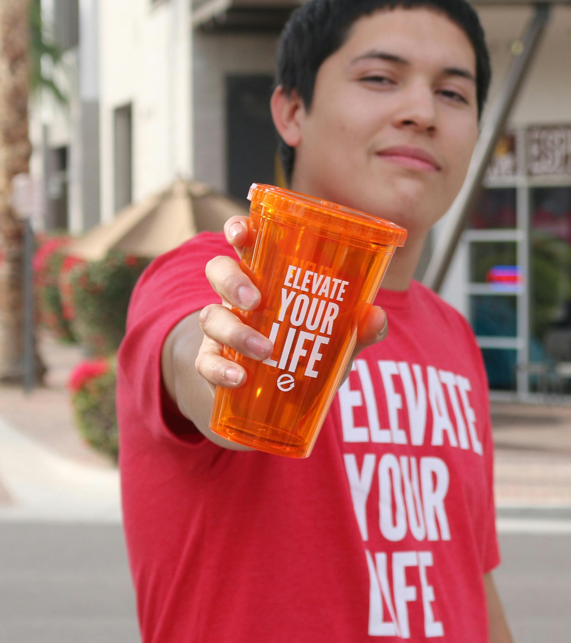
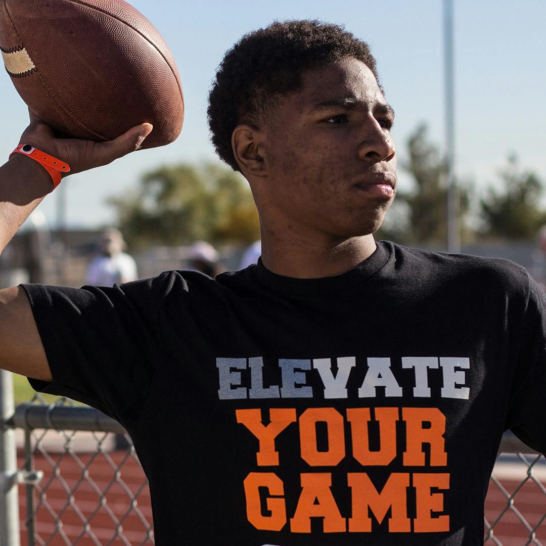
What better way to amplify brand awareness and introduce the new brand identity than through merchandise? From t-shirts to tumblers, towels to water bottles, we were committed to crafting merchandise that not only showcased the brand but also extended its reach to new horizons, stirring conversations Elevate will never be apart of. Elevate Your Life (EYL) became the tagline and propelling the EI brand to unprecedented heights. We fondly recall the skepticism when someone told us this shirt won't be worn outside of Sunday. Yet, these shirts have transcended Sundays and churches, making appearances at the gym, during errands, in schools, workplaces, and even on the hiking trails. Even babies were wearing an EYL onesie.
The Elevate Your Life brand was simple, but a truly effective in elevating awareness about the organization. We started with charcoal gray shirt featuring Elevate Orange text, but soon expanded to include a myriad of colors. With a minimalist design, our merchandise seamlessly adapted to the theme colors of events and various programs. We even expanded to a different language, "Eleva Tu Vida", to support the organization's mission work in Puerto Rico.
Strategy (cont)
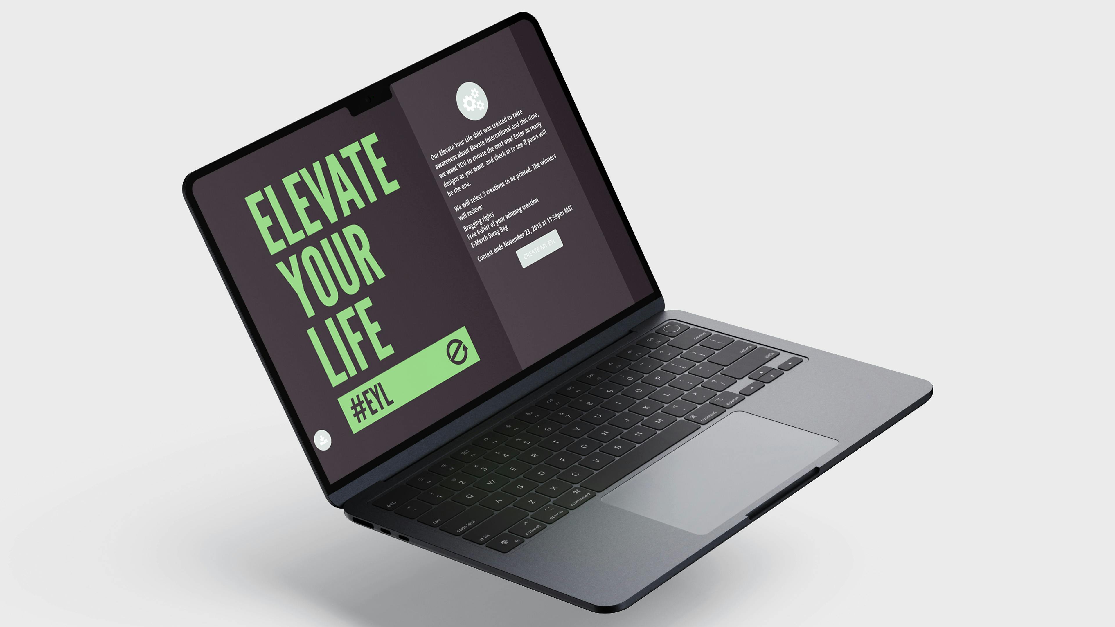
As our color combinations expanded, we sought to engage our audience further by allowing them to create their own custom color combination—a fun and interactive way to connect with our brand.
We introduced the My EYL contest, inviting individuals to submit their own combination. Participants were presented with a selection of five random complimentary shirt designs to choose from, with the added option to select their preferred t-shirt color and text color. Upon finalizing their design, participants could easily download it and were encouraged to share it on social media using branded hashtags, enhancing overall brand awareness.
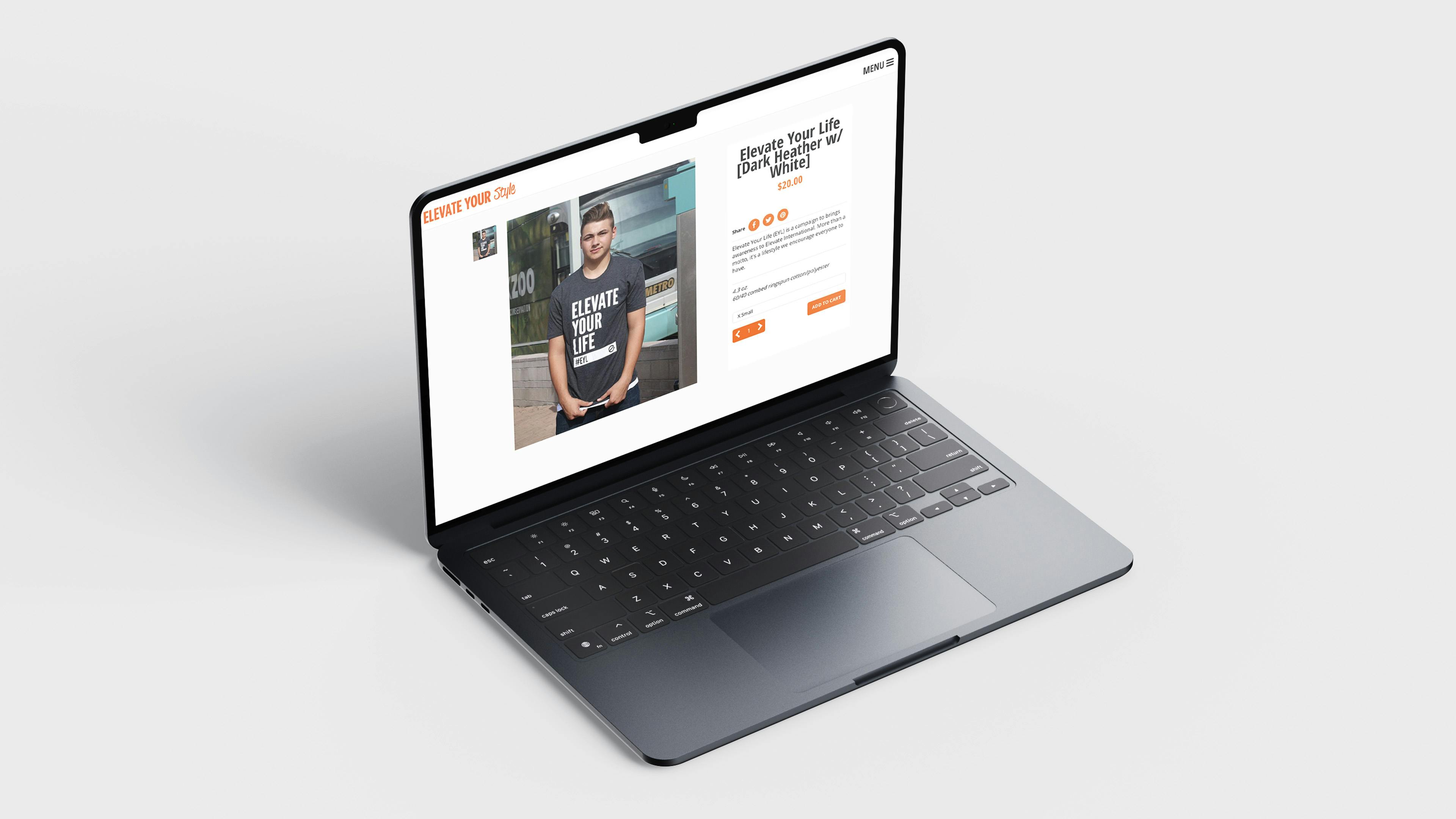
Utilizing Shopify, the Elevate Your Style store was launched, offering a platform to purchase EYL merchandise and other items such as Experience Cards (featuring recordings of main and breakout sessions from events) outside of core gatherings like Camp Elevate or Elevate Remix. This initiative not only enabled year-round merchandise purchases but also indirectly contributed to financial support and heightened awareness for Elevate throughout the year.
The Elevate Your Life brand extended beyond Camp Elevate or Elevate Remix, becoming a part of everyday life down the mountaintop. Whether in school, at work, or in various daily activities, the principles and values of Elevate Your Life were reaching new audiences.
Strategy (cont)
With the Elevate International brand firmly established and Elevate Orange ubiquitous, we made the decision to introduce the secondary color palette. Like its primary counterpart, the aim of this palette remained consistent: to infuse the brand with vibrancy and energy. While this palette could stand independently, its design was crafted to seamlessly complement the primary palette, offering versatility and a fresh source of inspiration. In addition to the orange for brightness, the inclusion of green and blue hues worked harmoniously to reinforce our brand's overarching goals.

Words from our client
- Elevate International
- Elevate International
- Elevate International
- Elevate International
- Elevate International
- Elevate International